Crash
1st March 1985
Author: Derek Brewster
Publisher: Hill MacGibbon
Machine: Spectrum 48K/128K
Published in Crash #14
King Arthur's Quest
Earlier this year a film of a famous book from the sixties, produced at great expense and supposedly the smash of '84 finally reached provincial cinemas. Despite great billing, it was quickly relegated to a smaller screen. Bad reviews, and the inevitable poor public response following closely behind were to blame. The film was 'Dune' (which, incidentally, I thought wasn't so bad) and it played second fiddle to a product fresh from the endless Spielberg production line.
King Arthur's Quest is, in some ways, rather similar. It is a finely constructed commercial package with Hill MacGibbon publishing a very smart product which has made space for itself along the computer shelves of one or two major department stores. The code on the tape is proficient enough and the graphics are interesting and colourful - but I'm afraid it will not meet with good reviews.
Not long after you start to Play you get that uncanny feeling that you are the first person to play it. You'd love to write off to the author and suggest how such a clever idea might be developed, polished and made commercially sound. Alas, it is too late, and so here we have a new entrant onto the professionally incompetent software scene. Unlike early games software this program has good, high- class packaging, seemingly instructive manual and neat (if overlong) program presentation on the screen. What it doesn't have is an ounce of sense. Over the months, reviewing many games, I have developed much patience, but I got a little angry to find on playing this game that I'd just researched a right load of bile.
Let's take the seemingly instructive glossy booklet contained in this large package. Commendably, it is well printed and very clearly laid out with sections on 'Getting Started', 'Exploring the Landscape' and 'Running the Program' giving details on the logistics of loading the Spectrum, mapping the adventure and working the game. It is only when you come to actually read the manual that you discover that either no-one checked it over, or that whoever did knew nothing about the game and, by inference, didn't want to know about the game. After struggling through the booklet, my guess is you won't want to know about the game either.
I was never one to excel in history at school (although, admittedly, schools are the last place to learn about anything) but what on earth has the Aztec world got to do with King Arthur? And why are the instructions inconsistent and confusing? Diagrams, numbers and text do not match or attempt to link up, and if it wasn't for the consecutive page numbering you would assume that some pages had been removed.
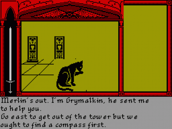
Unfortunately, the game itself is also just a little off-the- rails, or to put it more bluntly, deranged! There are several different areas to the game, each consisting of a 10 x 10 grid. On the screen you can see two grid squares in front of you, and one to either side. After reading the manual you should be ready for anything, but as you begin mapping it becomes apparent that you are not where you are - or to be precise, you are somewhere else! You are in fact on the first square directly in front. You are looking at yourself in front of you. YES, I know, I'm becoming as incoherent as this program, so let's just leave it as: when you move adjacent to, say, a door, and you turn to face it and go through it, it isn't there - it has seemingly moved down a block. With a little effort you soon get used to this glaring inconsistency, but why didn't the programmer do something sensible about it?
Although I didn't learn much geography at school, I began to get the hang of it when I left. It soon became clear that unless you position a map so that it points northwards, it is difficult to read and to get your bearings from it quickly. In the game you discover a compass early on and, like all the objects you collect, it is revealed on the right hand side of the screen. As you move it rotates to show you which way you are heading - but just to annoy those who are not such good map readers, it only shows north, when it would have taken minimal programming courtesy to have it indicate all directions.
A minor point, admittedly, but you are still left wondering why it should be so unhelpful. Perhaps the sense of annoyance it creates is to do with the most damning point about this game. It is so boring you just want to get through it as quickly as possible, and after waiting for the sluggish response you can't wait to get on with you next move.
King Arthur's Quest is a huge disappointment. I warmed to the theme and certainly, the packaging (which includes a spell- breaker poster) is colourful and interesting. The programmer has brought some skill to bear on the project but what this game lacks is not programming time, but design time. It has been thrown together with what can only be described as glossy incompetence.
Comments
Difficulty: quite easy
Graphics: simple, often confusing
Presentation: average
Input Facility: single key entry
Response: reasonable
Special Features: played in real time
Other Spectrum 48K/128K Game Reviews By Derek Brewster
Scores
Spectrum 48K/128K VersionAtmosphere | 5 |
Vocabulary | 3 |
Logic | 8 |
Debugging | 10 |
Overall | 5 |