Crash


Hell Fire

Author:
Publisher: Melbourne House
Machine: Spectrum 48K

 
Published in Crash #14

Hellfire

Greek mythology seems to have become a computer game vogue just recently, what with Ocean's Gift from the Gods and now this new game from Melbourne House in which the player re-enacts the trials of Ulysses.

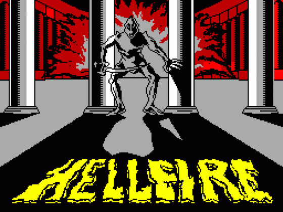
This three-stage game has the player guiding the ancient Greek hero up the slopes of Mount Olympus, whilst avoiding falling boulders and the stony stare of the Gorgon. Then he has to outwit the minotaurs in the Temple of Knossos and finally avoid being trapped in a maze with a Reptilian Assassin and a Fireball Thrower. The ancient Greeks were a fun-loving lot and would probably have approved of the violence in computer games.

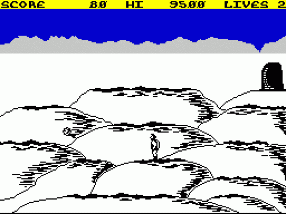
In Hellfire you effectively have three very different one-screen games. They have different graphics and require a different sort of thinking and arcade skill. On the first screen the hills are described rather as a child might draw them and Ulysses can run and jump to get from hill top (or ledge) to hill top. He can only stand on the darker bits. Meanwhile boulders bound down the hills threatening to knock him off. Occasionally a Gorgon, possessed of the power to turn men to stone with a single stare, will appear and Ulysses must raise his shield to reflect her gaze.

Hellfire

Getting safely to the top sends you into the second screen, a temple made of three tall columns and three levels plus the floor. The exit is at the top but the way is blocked by dashing minotaurs. Running behind a pillar transports you to another floor and another pillar. The trick is to discover the correct route without getting speared by a nasty. Fortunately there is an ancient Greek trampoline which enables you to jump to any level. The third screen is a scrolling 3D maze from which you must find the exit. You can use a mace to kill your opponents and more maces can be found in chests scattered through the maze. The maces can also be used to smash open exits.

Incidentally, the cover of this game has been designed by Steinar Lund, on whom we carry an article in this issue.

Comments

Control keys Q/S,A up/ down, I,O,K,L/P,ENTER left/right, Z-V raise shield, B-SPACE jump
Joystick: Kempston, Sinclair 2
Keyboard play: responsive, although a bit of a handful in tight spots on screen 1
Use of colour: very simple
Graphics: excellently drawn and animated
Sound: none
Skill levels: progressive
Lives: 5
Screens: 3

Comment 1

Hellfire

'Hellfire is a highly original platform/maze game. It has very good graphics (Melbourne Draw) and all the characters are well drawn and animated. Unfortunately there is no sound which makes the game slightly less playable. The first two screens are really just to warm you up for the last one in glorious 3D, as they are quite simple. But once you do get to the final screen you find it impossible to complete as the chests, which are supposed to contain extra maces, don't (or if they do, I don't know how to get them)? When your last mace is used up you get transported back to the first screen again.'

Comment 2

'Melbourne House always seem to go for games which are slightly different to what everybody else is doing, and Hellfire is no exception. It has the usual great graphics you would expect from them, and the game's not too bad either. The colour is a bit sparse but is used to complement the 3D effect on the third screen quite well. Hellfire is quite addictive, but it can be off-putting if you totally fluff up the first screen. Overall quite a good game, which is hard at first, but after you've got into the game, l don't think it will take too long to complete it.'

Comment 3

'First off, I think it should be said that the three little screen shots on the inlay are misleading, because they show all the screens in glowing colour, which simply doesn't exist in the game. There is colour but it is much flatter and more simple than Melbourne House are pretending on the inlay. The first screen, for instance is only in black and white with a tiny strip of blue and grey at the top, while the second is black and white with a pale blue background. Despite this, the graphics are extremely good, especially the animated characters. The first screen is hard until mastered, which takes a bit of doing. The second is a visual puzzle which also takes time, but then is simple once done. Whereas the third screen seems simply baffling to me. Obviously that's going to take a little longer. But to be honest there isn't a hellfire of a lot here to do. The maze screen is obviously the main part of the game, but if it is any bigger than you can see when you first enter it, I think it would have been more clever of Melbourne House to suggest it, because without knowing that I would have to say that this game has great graphics but is a poor game.'

Other Spectrum 48K Game Reviews By


  • It's The Wooluf Front Cover
    It's The Wooluf
  • De-Fusion Front Cover
    De-Fusion
  • Robot Riot Front Cover
    Robot Riot
  • Frenzy Front Cover
    Frenzy
  • Mountains Of Ket Front Cover
    Mountains Of Ket
  • The Guardian Front Cover
    The Guardian
  • Buriabeast Front Cover
    Buriabeast
  • Spooked Front Cover
    Spooked
  • Gotcha Front Cover
    Gotcha
  • Mr. Wong's Loopy Laundry Front Cover
    Mr. Wong's Loopy Laundry