Amiga Power
 1st October 1991
Categories: Review: Software
Author: Matt Bielby
Publisher: Mindscape International Inc
Machine: Amiga 500
Published in Amiga Power #6
After the disappointing Gods, the pressure in on for those Bitmaps to come back with a real winner, but does Magic Pockets have that magic?
Magic Pockets
And so we get to the second release through Renegade from The Bitmap Brothers, and yes, it's as professional and good looking as anything we've seen from them. Graphics are nice (don't worry, I'll get a bit more specific than that in a minute), there's lots of it, and Betty Boo warbles away in the background to good effect. General opinion around the office has it that this is a lot better game than the recent Gods, if again falling short of being a real Bitmap classic of the order of, say, Speedball 2.
Me, I'm not so sure. If pushed I'd actually say that I enjoyed Gods a lot more. That was a game that initially seemed a bit, well, ordinary, but grew on me as I played it. Magic Pockets, on the other hand, seems a bit ordinary and remains fairly ordinary all the way through. It's not 'bad' as such - indeed, there's a lot about the game that's really very good indeed - but it could easily have been two or three times better. The simple fact is that if this game came to us out of the blue we'd be saying, "Hey, these Bitmap Brother folk look like guys to watch - iron out a few problems and they could go far". As it is, they're perhaps the most celebrated games creators in the country, and so anything less than excellent from them comes across as little more than a damp squib.
The first thing that you have to say about Magic Pockets is that it's a real what-you-see-is-what-you-get sort of game - something the Bitmaps haven't really involved themselves with since Xenon 2. That's not to say it hasn't got the secret rooms, hidden ways of collecting bonuses and so on that work so well in Rainbow Islands, Mario or whatever - because it has - but that there's nothing really clever going on beneath all that. No discernible artificial intelligence to the characters, no hardcore adventuring a la Cadaver, no particularly radical new ideas at all - this is a game that stands or falls on pure game design. And - oh dear - it might not quite have falled, but it's certainly tripping up all over the place. Game design-wise this simply isn't all that good.
So, going into Mr. Negative mode, what's wrong with it?
-
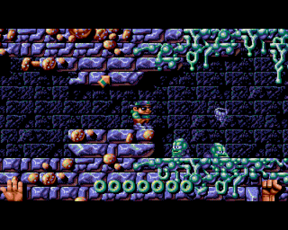
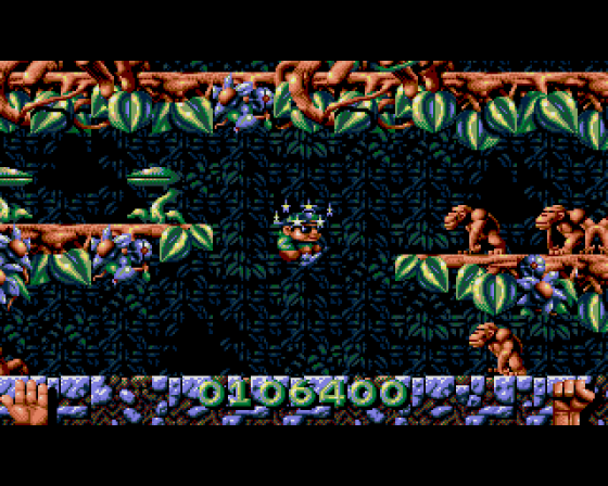
The graphics. Now Mark Coleman is a very talented gentleman with a very distinctive style that's worked very well on a lot of Bitmap games in the past - Xenon 2 and Speedball particularly - but on this evidence his style simply isn't suited to cute games. Try as he might, he can't seem to get away from that distinctive blue/grey metallic effect the Bitmaps have used two or three times too many already. Indeed, the first level of this is almost a re-run of Gods visually - though without the distinctive detailing of that game - and even when he gets out of the caves and into the forest and later levels his palate seems dominated by blue and brown.
The sprites have a similar problem - they're cuter than stuff he's done in the past, but still rather too menacing for a platform game. They don't seem to do anything very interesting either, but then that's not really his fault, is it? - The levels. Oh dear, oh dear. How many times have we seen a forest, a lake, some caves and a snowy mountain top? Quite a lot I'd say - this is as generic as it gets. If you're not going to have any real link between levels - and you don't seem to get one in Magic Pockets - you should surely be able to come up with some better ideas than this. Just to prove it's not that difficult I'll try to think of some off the top of my head. How about one level set in heaven (with lots of clouds, angels, etc) and one set in hell (all red and lava-like)? Or what about a set of levels based on ancient cultures - a Viking level, an ancient Egyptian level, an Aztec level and so on? Or perhaps one level set in a burning building, one set in a sinking ship and so on, disaster movie style? Or one level that's all early '70s hippies, one that's all late '70s punk, another with New Romantics in and so on? (You could have pastiches of particular people - Gary Glitter, Sid Vicious, Boy George - as the baddies). Okay, so some of these ideas might be a bit crap, but at least they're ideas - which is something you don't find (outside of small detail touches) all that many of around here. Honestly, I should have been a games designer.
-
The feel. Quite a vague one this, but you play it and you'll realise almost straight away that it's wrong. Kid is anything but light on his feet - he's too slow, he feels too heavy, and he's not particularly good at changing direction when jumping. In Gods, the pace seemed a bit slow - the main character clumped around fairly slowly - but as the game was a fairly methodical puzzle/fighting based thing it didn't matter too much. Here it's very out of place.
It gets worse though. This is - or at least should have been - an arcade skills-based game. Since you've got a rather esoteric weapon system - the elemental weapons you throw go in a (sort of) controllable arc - the skill should be in working out just how to hit any particular moving baddie. It *shouldn't* involve you having to hit them again and again (and again) - many of them more than outstay their welcome and it becomes quite tedious having to bash away at them six or seven times to kill them off. More than a few people I've seen playing Magic Pockets have complained that it's too repetitive, and 99 percent of the time this is why. A game of this size demands more of a challenge than just bashing away at an endless stream of rather characterless baddies. - The lack of character. I've touched on this already, but anyway...
We've already got ourselves in quite a lot of trouble for slagging off a game (Brat) for having an annoying central character so I'm not going to repeat the mistake here. It does have to be said though, the Bitmap Kid has little to recommend him. Some characters you feel for, some you simply don't - we'd take Tiki the kiwi from The New Zealand Story or Bub and Bob (Bubble Bobble) over this pixelised Danny-out-of-the-New-Kids any day.
The baddies are a similar sorry story. Taken individually the graphics are all fairly good, but Mark Coleman has a problem - he draws everything the game. The overall style dominates more than any of the individual characters. The real problem though is that they all just wander about a bit - none of them are given anything particularly interesting to do.
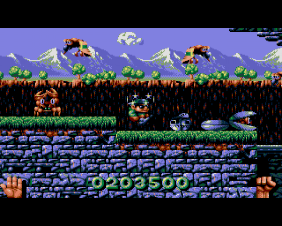
But it can't be that bad, surely? Well, no, perhaps it's not. When most people see this, they do "Hey, that looks good!", and they're right. And it does, initially, look more impressive. Stylish, and packed with neat little presentational touches that lead you to expect much more from the game than you actually get. Things like:
- The little directional arrows that whiz up into the air, pointing out which way you're meant to go.
- The (rather old fashioned and wooden looking) TVs that crop up along your route, freezing the action and putting you into a long-shot map view, allowing time to get your bearings. (Surprisingly, these turn out to be of precious little use when actually playing the game.)
- The vast selection of fruits, sweets, and other goodies - including cocktails, a rather suspect collectable for a seven year old! - for you to pick up en-route. Various involved ways of collecting extra points - too complicated for me to go into here - provide a variety of other neat effects too.
- The way that when the Bitmap Kid finally fies the world sort of closes down around him, leaving him trapped outside on the black end of game screen.
- The different weapons he gets to use. Now while I'm not convinced that one single upgradeable weapon - such as the rainbows in Rainbow Islands - wouldn't have been a better way to go, these do allow for some neat touches. The way the snowballs can be rolled to create a big ball, the way whirlwinds can throw you about the room, the way ice freezes water and clouds drop rain to grow forest trees (very similar to part of the upcoming Captain Planet) all have to be applauded.
- As do individual spot effects - my favourite being the way Kid struggles when dropped in water without a helmet.
The Kid Gets A Rough Ride
Phew. I've given Magic Pockets a bit of a rough ride, but I think it deserves it - it's simply a very average game tarted up with lots of nice effects and presentation, and certainly a far cry from the sort of product we should be expecting from creators as talented as the Bitmap Bros. Attractive though it may look, I've got simply no incentive to play it beyond the purposes of writing this review, and while some folk seem to disagree with me, the vast majority of people who've played it seem to be expressing a similar sort of dissatisfaction.
Indeed, there's a large groundswell of opinion here that thinks it's a 60 percent game, but I think there's enough that's good about it to justify my mark. Dull.
The Bottom Line
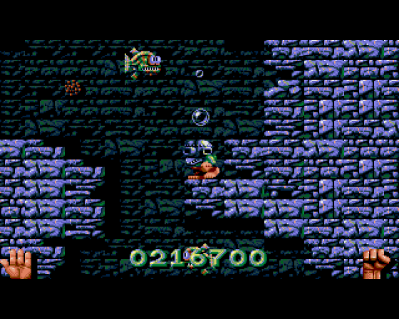
Uppers: Slick graphics and typically neat Bitmap presentation allied to an archetypal cutesy platform game design provides a lot of immediate fun...
Downers: ...which palls very quickly when you realise how dull, samey, repetitive and unimaginative it all is.
A very disappointing second release from Renegade - not because the game's bad as such, but because it simply should be a whole lot better. No one's going to be loading this one up for fun six months down the line, that's for sure.
Other Reviews Of Magic Pockets For The Amiga 500
Magic Pockets (Mindscape International Inc)
Do the Do with Magic Pockets on the Amiga. Platforming frolics featuring a kid called Kid.
