Personal Computer News
 28th January 1984
Categories: Review: Machine
Author: Ian Scales
Published in Personal Computer News #046
Meet The Macintosh
No, we have not stooped to reviewing raincoats, we just let Ian Scales loose on Apple's latest progeny
Some new micros offer little more than a drop in price, or a slightly novel facility; not many make you think you're witnessing the cutting edge of computer technology.
But then, very rarely, you know you're seeing something which represents a big step forward.
Such was the first impression of Apple's Macintosh (nothing to do with winter apparel, a Macintosh is a strain of Apple). Apple is hoping to see the Mac repeat the success of the Apple II, but the new machine is no 6502-based upgrade along the lines of the Super IIe. Instead it's a downgrade of the much-acclaimed Lisa (PCN, issue 1), complete with a full 16-bit 68000 processor, 128K of RAM and 64K of ROM.
Like the II it will make extensive use of third party softwre and peripherals, but it slots into what Apple terms its Lisa family of products.
In many ways the Mac is the antithesis of the Apple II which was very much a 'configure it yourself' system (see PCN issue 41 for an overview of the II) requiring its users to get inside the case and add cards to incorporate such features as 80 columns of text, printer and disk drive interfaces, and so on.
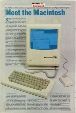
The Mac has been designed as an unpack-and-use-it system. It's an integrated unit with a single micro floppy drive, monochrome screen, detachable keyboard and mouse and it packs into a reasonably portable bag.
But the real feature of the Mac is not what it is, although its hardware specifications are impressive, but the way the software presents itself.
Early in 1983 Apple released the Lisa. The Lisa is an expensive machine with a megabyte of RAM, a hard disk, 68000 processor and two subsidiary processors. Apple's idea was to use the power available through a 16-bit processor to substantially enhance, not so much the sort of processing which could be carried out, but the power of the user interface.
The Apple approach takes the reasonable view that users want to ake a computer home or into the office, plug it in and start working. With the present crop of (non-Apple) operating systems and application programs this is not easily achieved. Although the average application program is becoming 'friendlier' to use by incorporating more menus, better documentation, and more consistent procedures, there is still a long way to go. The basic problem that computer A is designed to use operating system B or C which in turn run application programs from various companies.
Because of this diversity among software suppliers there are always distinct differences in the way each application program interacts with the user.
Every time you use a package you have to sit down and spend several hours learning a new set of procedures, control codes and function codes. They're not called codes for nothing!
How much easier it would be if the programs run on a computer used a consistent method of presenting themselves. When I use a package (it's usually a word processing program), I construct an imaginary model of what's happening to the information as I manipulate it around the system.
For instance, I subconciously understand the scrolling function as just that - as the text is scrolled down the screen I have the image of it rolling up at the bottom and unfurling again when I need it.
I find it's crucial to have a mental model of what's happening with the files - a system which mysteriously starts mucking about with intermediate swap files without telling you that it's doing is most unsettling. It takes a lot of time to understand a process like this and have a model mapped out in your mind.
The problem would be part-solved if applications programs used a common set of procedures - dedicated function keys with overlays for each separate application is one popular method as an alternative to a fairly meaningless clutch of control codes which must be learnt by rote.
Apple has taken the 'friendly' approach a step further. What most new computer users are used to is paper technology. they understand information and its storage and organisation in terms of pieces of paper, folders, rubbers and pencils. The setting for these storage media and tools is usually a desk.
Like Lisa, the Macintosh presents material on the screen just as if it were on the top of a desk. The Mac makes full use of a mouse. The mouse is a hand-held device used to position the cursor on the screen by means of a ball arrangement. As it is drawn across a flat surface, the ball rotates and the cursor is sent in the appropriate direction.
The Mac mouse also has a single button - so you move the cursor to an appropriate icon, then press the button to cause whatever function you're after at the time. The icons are small representations of such things as waste-paper backets, pencils, and so on. In some cases words are used instead of images.
Getting Started
At the pre-testing of the Mac, I was able to use the standard Mac word processor, Mac-Write. A session at the computer goes something like this.
The first thing is to load up the application program - nothing unusual here: you simply slide the microfloppy into the single disk drive and the appropriate code is automatically booted into the system. An interesting feature of the disk is its ability to spit the disk at you at the appropriate moment - at the end of the session or when a new data disk is required, for instance.
Once the whirring and clicking is over, the Mac's representation of a desktop with various options in the form of icons and sheets of paper are displayed.
At this stage it's all mousework - you simply use the mouse to position the cursor over the appropriate icon and press the button. The whole process is fairly self-explanatory and easy to learn. But this initial process is even more fascinating if you watch a practised user.
The prime bugbear with the conventional type of 'friendly' user interface is that the 'hand-holding' way the program goes about coashing the user can become decidedly tedious once the procedures have been learnt.
Using a mouse you can become ultra-speedy within a relatively short space of time - zapping the cursor back and forth, pushing buttons and causing magical things to happen, and far quicker and easier than with a conventional arrangement.
The features of the word processing system are quite staggering. For instance, there is a line of words above the document - 'font' and 'style' for instance. By putting the cursor over the word font and pressing the button you get s amll document rolled down over your existing document, and it stays there as long as you keep the mouse button depressed.
You then move the cursor down the little document until you reach the specified font (the kind of type-face you require to appear on screen), release the mouse button and the existing text and everything you type on your document from this point on appears in that font and style.
The Hardware
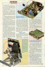
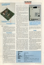
The Mac is designed as a take it home and turn it on, complete with a core of firmware, which controls the disk operating system and a lot of the routines necessary for the graphics representations i.e. the icons.
The object is to force software developers to provide a common user-interface. According to Apple the firmware is well tested and (as far as is known) bug-free. It would seem sensible, therefore, for anyone writing software to avoid re-inventing the wheel and include the tailor-made routines.
Apple plans to sell a lot of Macs: companies always say this, but this one is talking about an automated assembly line process capable of churning out a machine every 27 seconds. Apple has cause to be this optimistic. The Mac features stunning performance for its price.
It would be a mistake to view the Mac as a cheap Lisa - the problem with integrating software is that you have to provide a lot of power and memory for the system to do it (and do it quickly enough for it to be of any use). The Mac doesn't allow the user to luxury of concurrently available applications programs.
Apple makes no bones about the fact that the system still involves a fair amount of disk-swapping.
The machine has been designed so that it is only necessary to use one disk drive - a 3.5" Sony with 400K. This makes back-up problematical as it requires multiple swapping, but the machine eases the burden as far as possible by ejecting the disk at the appropriate moment and asking for the next.
It will be possible to add an extra drive, and other add-ons can be daisy-chained from the back of the machine through an Apple standard bus. It will be up to the third party peripheral suppliers to provide many of the extra goodies like a Centronics interface.
The Mac comes with two RS423 serial interfaces: one has been designated for use by the printer and the other will be for communications.
The dedicated printer seems a very impressive beast and is priced at around £350. It obviously has to be capable of commiting what appears on the screen to paper (fancy typefaces and graphics) and this it does at a good speed considering Apple's competitive pricing. The printer will be called the Imagewriter and is manufactured under licence in Taiwan to Apple's own design.
The Mac also has impressive on-screen graphics. By snatching the relevant icon with the mouse you can easily draw lines, do shading, lasso areas of graphics and integrate the results into the word processing package.
Apple has gone firmly for monochrome display so far in the 'Lisa range' - it keeps the price down, the resolution up and, as Apple rightly points out, the hard-copy output is usually photocopied in any case. Around the office, for instance, the drawing facilities of the Mac will make it ideal for composing forms.
The Mac is only one in a planned range of Lisa products and as such has been priced to occupy a certain slot. It would never do to have a cheaper product almost competing with the Lisa or whatever else Apple decides to take off the stocks and into the shops.
Apple fondly remembers the good old days of the Apple II when every West Coast programmer and his dongle was working on Apple II software. The big hope with the Mac is that the strategy to provide an open system together with a sophisticated and presumably slightly straight-jacketed operating system will not only prove attractive enough to convince software writers to create a diverse and inventinve array of products to run under it, as they did with the Apple II, but that the end results will provide a reasonable amount of integration and a consistent user-interface. In effect, Apple hopes for the sophistication of Lisa coupled with the third party activity which produced VisiCalc.
Verdict
On first appraisal it appears that Apple has come up with a winner. According to the company there are more than 100 software developers currently working on products. Apple hopes that it can control the end-user prices for applications programs at around the £75 mark. One of the companies currently beavering away is Microsoft which is redoing a version of Multiplan.
Apple also vows to keep a tight rein on the price of the Macintosh - in the UK the only price changes expected for the life of the computer will be caused by fluctuations in US/UK currency rates.
However, expectations in this area of microcomputing may change radically following the launch of the Sinclair QL.
Obviously, we hope to be able to give you a more detailed look at the Macintosh in action once the machine is available (which it will be by the time of publication). If anything can take on the IBM PC and its compatibles this machine can.
Specification
| Price: | around £1,800 |
| Processor: | Motorola 68000 |
| RAM: | 128K |
| ROM: | 64K |
| Text Screen: | dependent on fonts and type sizes |
| Graphics Screen: | 512 x 342 |
| Keyboard: | 58 keys plus mouse |
| Storage: | 1 3.5" drive |
| Interfaces: | RS432 dedicated printer interface, RS432 communications, mouse connector, disk drive and bus connectors |
| Distributor: | Apple Computer (0442) 60244 Eastman Way, Hemel Hempstead, Herts HT2 7HQ |
This article was converted to a web page from the following pages of Personal Computer News #046.


