Everygamegoing
 23rd June 2023
Categories: Review: Software
Author: Dave E
Publisher: Snuggsy187
Machine: Acorn Electron
Exile
"Why me?" Finn grimaced. "Why is it always me?" He knew the answer, of course. He was the best.
Yes, the best man for the job in the best game ever for the Electron. Exile. The masterpiece. The game that managed to fit a whole planet, with an entire, living eco-system, into roughly 28K, along with the most epic mission, the most ingenious puzzles and the strongest sense of immersion ever. I've played it hundreds of times, reviewed it twice and even have something of an "Exile Collection" of my own, consisting of the original Electron tape, the BBC tape, the C64 one and the Amiga 3.5" disc. Which makes me something of an uber-fan, both of its hero Mike Finn and everything that surrounds him. That classic exchange above, that takes place in his own mind as he sits in his spaceship above the planet Pericles, almost sends a shiver down my spine.
Now, seeing as I've already reviewed Exile before, I'm not going to go over old ground about what makes Exile so great. Just take it as read that it is. And now we've got a new 'version' for the Electron only, adapted by Snuggsy187 and which he has christened Exile Helper. I think that title is a bit weird, as it makes this new version of the game sound more like another one of those "utility programs" published in the 8-bit press of the day - those ones that allowed you to cheat, or start the game with all the guns and several of the useful objects. So I'll just be calling it Exile in this review, because that's what it is, it's the exact same game in the exact same scrolling window, with the exact same garbage on the screen that we were told by the programmers, was necessary for... well, technical reasons.

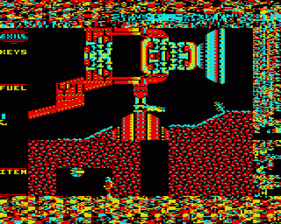
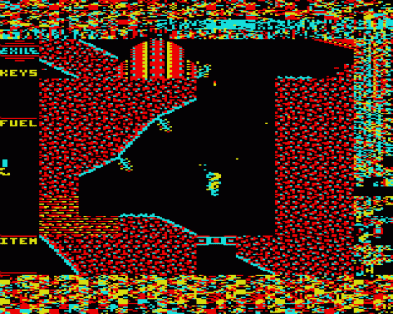
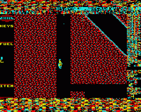
However, there's a big difference in this new version. A vertical area on the extreme left of the playing window has been replaced with a groovy-looking status panel, dispensing with the need for the 'Administrator' program that players usually needed to understand in order to make any real progress in the game. Let me explain...
Exile is a huge program. In order to get it into the Acorn Electron, it has data arranged in a complex, encrypted fashion, and it generates the planet itself both recursively and procedurally. Some people who have disassembled the binaries have described its building blocks as evidencing a "Godlike" mentality of its programmers. When Exile is running, it takes control of the entirety of the machine in such a way that it overwrites whole areas that you usually need, for example, things like the graphics for letters and numbers and even the stacks used for controlling the input/output to cassette and disc! Which is all well and good when you're playing the game itself, but has the side effect in the original game that you cannot easily assess your progress during the game itself. Saving (and re-loading) your position is extremely complex too - you have to load either the 'Savegame' program or the 'Administrator' program to do it.
Basically, what this version of Exile is, is a very limited re-skin. As you collect up the items like passes, guns and the protection suit, they now appear in this new status panel. In the case of the guns, you also get a vertical energy bar which shows you on-screen exactly how many kilojoules of energy it has "on charge". If you've never played Exile all the way through (or, more likely, if you've never read the whole instruction manual), then you might be blissfully unaware of the fact that the guns do run out of energy. Indeed, that's why you occasionally find those power pods which you can collect and which immediately disappear when you 'store' them. The original Exile used a system of sounds to denote the amount of energy each gun (and even your jetpack) contained, and you could transfer kilojoules between jetpack and gun(s) with CTRL and the corresponding function key. This system remains in this new version, but you can actually see the energy transfer taking place which looks pretty nice. It's also good to know if your icer is about to run out of firepower, and which guns and passcards you have in your possession. Of course, it's nothing that the Administrator program wouldn't have told you back in the day - it's just a lot less convoluted a process to find the information out when you don't have to quit the game and load in that Administrator program. Instead, a lot of that info is just... there.
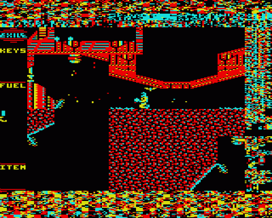
And yet, I'm not convinced it actually is an improvement. Unlike some of Snuggsy's other upgrades (Repton 2, for example) there's nothing else here to play with. There's no bigger play area, or improvement in scrolling, etc. Instead, all that is different is this additional status area (and the removal of the copy protection, I suppose). If you're playing from the very beginning, Exile is one of those games that can easily eat up an hour before you even find your first collectable item, so the status area is obviously going to sit there completely empty for a heck of a long time.
And, much of what I love about the original Exile (and I'm sure I'm not alone in this) is precisely the fact that, once you do start to play it, there are no distractions. The Status area, nice as it is, is exactly that - a distraction from the total immersion of the original's main playing area. It feels very weird to be praising the quirkiness of the original, because loading the Administrator and the Savegame utilities are a pain in the posterior, but there's something about that window onto Finn's environment - with that completely featureless, cluttered border around it - that just suffers from having the left-hand side shaved off it. I can best describe it as looking at a version of The Mona Lisa with Leonardo Da Vinci's signature scrawled across the entire bottom of the canvas, rather than it being an understated squiggle in a corner. Yes, the painting remains the same, but the 'art' is affected in some mysterious way that I can't quite put my finger on.
What's more peculiar though is that I cannot imagine that, had the original Exile included this status panel skin, I would ever have criticised it at all! Likely I would have accepted it without question.
Overall then, I find myself thinking that some people will love this and others, like me, will be rather ambivalent about it. If you haven't played Exile before then this might well be a version of the game that you find a little bit easier to understand, that looks a bit more 'modern' and that stops you having to fiddle around with the Administrator program if you just want to review what you're carrying in real time. If you've played Exile as much as I have, then you will probably regard it a bit like an additional 'option' that you now have, a little like when you can toggle subtitles on and off when watching a movie. It's just a personal preference. If you think Snuggy187's new version will make the game a bit easier, then by all means opt for it when choosing a 'version' of Exile to play. Whichever version you do choose, just remember: Exile will always be the best game ever written for the Electron.
