From the blogs
maintained by Kecske Bak
Some time after the release of Repton 3, Paras Sidapara started work on Repton 4 for the BBC Micro and Acorn Electron, a new Repton game with several novel features. When Repton Infinity came along the game was reworked as a new game, Cyroid: X, before being dropped completely.
Paras's Repton 4 game was thought lost until a year ago when it was recovered from an old 5.25" disc. Development on the game resumed, and Retro Software got permission from Superior Interactive to release the game for the BBC Micro and Acorn Electron. The project was retitled "Repton: The Lost Realms" in order to avoid confusion with the Repton 4 game in Repton Infinity and Superior's Repton 4:EGO game for the Archimedes.
Dave Moore of Retro Software approached me and asked how I would feel about trying to come up with some cover art for the game.
I bit his hand off. Repton was a bit of an obsession to me when I was growing up, and no Christmas was complete without me receiving the latest Repton release. I spent hour upon hour playing, designing screens and designing graphics. The game itself looks like Boulderdash superficially but is a very different creature to play - it's more of a logic puzzle and attracts large numbers of chess players.
The first thing I did was to doodle on the back on an envelope whilst I was on the phone:

The Scream |
The Repton in the sketch owes more to Edvard Munch than Tim Tyler, but it showed roughly what I wanted to do. My idea was a bit like "The Secret Garden", with Repton opening a door and finding fantastic "lost realms" inside. Doors are also a feature of the game itself, so it seemed the obvious thing to do.
I chose to produce the artwork in vector format. This was because as we planned to print everything from small tape inlays to A2 promotional posters from the artwork. This meant I had to export 600dpi bitmap images from my work, so vector artwork seemed the best way to go. I chose Inkscape as I'd heard it's the best vector artwork package available, it runs perfectly on Ubuntu Linux and because it saves artwork as, svg, a completely free format.
The original Repton artwork was done by Ellis Ives Sprowell Partnership in Wakefield. They gave Repton a very strong brand image so all I had to do was follow their lead and not mess it up. The REPTON logo was traced in Inkscape from a scan of the advert for the original REPTON release to get it as accurate as possible. The subtitle was in the font Eras, just as it was in the original releases.
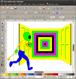
As this was my first major project in Inkscape I started simple. Just outlines and solid, non-gradient fills. I drew Repton, a couple of doors and a transporter and then sent it to Dave and Paras.

Start off simple |
Paras's wife seemed fascinated by Repton's bum, but apart from that everyone was happy so I decided to explore flood fills and shading.
Gradient fills gave me endless trouble in Inkscape for a long time. This is because having been so used to the way Adobe Flash handled gradient fills: creating them in a dialog box. Therefore I simply assumed I was supposed to use them the same way in Inkscape and it gave me endless headaches - creating gradient fills using the dialog in Inkscape is for masochists. It wasn't until after I created the botched artwork for "Zap!" I finally worked out the "Inkscape" way to handle flood fills - using the gradient tool and the mouse - and never had a problem with them again.
Anyway, taking about three times as long as I needed to, I finally created a shaded image. I also tried some blurring and glowing too, and was happy with the results so far. The idea is that Repton is in darkness but lit by light coming from the transporter. I had to fight a bit for this with Dave as he understandably wanted everything light and bright to make his posters and packaging eyecatching, whereas I wanted the lighting to be more moody.

I wish I had known what I was doing... |
I chose cartoony black outlines for the poster, to match the original Repton artwork, and also tried hard to make my Repton character look like the Repton in the original artwork.
Next, I needed to create all the other game characters eminating from the "lost realms" doorway. Because of the need to create cover artwork of varying aspect ratios for cassette, disc, posters and in order to make life simpler I created each of the game characters in a separate Inkscape file. That meant I could put the picture together at the end. This saved me hours and hours of work in the end, as the final composition was a result of a lot of too-ing and fro-ing between Dave and myself.
The individual characters took between an hour and four hours to create, the crown taking the longest. Many of them are deliberately based on the original artwork for the Repton games - for instance the diamond, safe, boulder and cage. I did this to underline the fact that the game is part of the same family as the rest of the Repton games. I'm particularly pleased with the way the safe turned out.

Bunch of dodgy characters |
The spirit gave me the most trouble as it's a very difficult thing to portray in a "cartoon" like way. Look at the spirits in the previous Repton artwork to see how tricky they are to do justice to. In the end I based the spirit on Matthew Atkinson's Repton 3 design. I also had trouble with the egg - my first attempt looked like "a yellow finger nail" according to Paras! Incidentally, you may notice a fly agaric - I've always liked toadstool fungus in Repton, but Paras and Dave vetoed the idea.
After abandoning my idea of a brick wall (like the one in my pencil sketch), I'd originally intended the artwork to be on a black background, but Dave Moore suggested a green gradient fill, which worked out very well indeed. And with that, it was finished.

The end result |
The final artwork worked out very well - as a first major project in Inkscape I'm quite proud of it. It has the Repton feel that I was after and also shows off the new features of the game prominently. Dave Moore told me he asked Richard Hanson of Superior Interactive if he would have used my artwork at the time. He said "Yes", which put me on a high for a week.
Contributing to an officially sanctioned Repton project of any kind makes you part of BBC Micro history and I'm very proud to have contributed to a real Repton game - it's a long standing ambition fulfilled.
Repton: The Lost Realms is currently under development by Retro Software. Repton name used with permission from Superior Interactive.


 20th December 2010