Zzap
 1st May 1987
Categories: Review: Software
Publisher: The Power House
Machine: Commodore 64
Published in Zzap #25
Terminator
Earth is under threat, and the only barrier between survival and extinction is you and your trio of customised alien-mashing space fighters. The enemy invasion force seems indestructible, but there is a large chink in the alien's armour - seventeen horizontally scrolling planets, whose destruction would scare the alien task force into submission...
The action is viewed from the side, with squadrons of alien craft moving in from both sides of the screen. When enough alien attacks have been endured the planet changes colour, and the player has to make a second, identical attacking run. This time the planet gives up the ghost and blows up, allowing the player to partake in a bonus game.
The screen displays a horizontal row of numbers, representing bonus points. A light flashes along, and the player attempts to stop it at the highest number by pressing the fire button. Complete this action and the light switches to the lower display, where it whizzes around a circle made up of two 'win' and two 'lose' icons - stopping on the 'win' icon gains the points.
SJ

Terminator is heavily Uridium influenced in most aspects - except execution and playability. The attack waves lack variation, and the graphics are generally poor. The inherent bugs are also annoying: having just finished a screen, the planet should be destroyed - instead, the program it upon itself to destroy you!
Terminator is simply no fun at all... and without that what's the point?
JR
Turn back the clock! The ghost of Uridium past returns to shake its rusty chains, and hoot and wail dismally. This is a particularly poor variant on the tried and tested horizontally scrolling theme which looks as though it has only recently been exhumed from a past grave.
The juddery scrolling, amateurish graphics, glitching sprites, poor game design and naff bonus screen are combined brilliantly to produce a designer heap of rubbish. The scrolling is pathetically slow, and the ship's fire-power is about as useful as a pea-shooter against Trident.
The final insult is the 'special offer' on the inside of the inlay - it reads "For a *free* Power House poster, just send 50p and an SAE to Alpha Omega." Very droll...
PE
If only The Power House's games matched the standard of their artwork... Terminator is desperately dull, and involves little skill - it appears to be a simple case of being in the right place at the right time.
There is minimal graphic variation - what's there is reasonable but it rarely changes. Terminator has been done many times before, and has usually turned out better than this.
Verdict
Presentation 57%
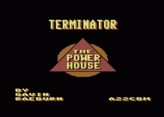
No options, a poor title screen and scrolling message. The game design is also flawed.
Graphics 36%
Ineffective backdrops and sprites which judder and glitch when the scroll routine gets into gear.
Sound 25%
An awful series of noises on the title screen try to pass off as a tune - and fail! The spot effects are poor, too.
Hookability 22%
Simple enough to pick up and play, but the frustrating game structure and slow speed drown any enjoyment.
Lastability 14%
There's little to keep even the most masochistic shoot-'em-up addicts enthralled.
Value For Money 25%
Two quid isn't much these days... but to throw it away on this dross is a bit extravagant.
Overall 17%
A very simple, frustrating and unrewarding Uridium clone. Don't even consider looking at it.


