Blast Annual
 7th July 2020
Categories: Review: Software
Author: John Davies
Publisher: Taylor Pottery Studios
Machine: Spectrum 128K/+2/+3
Published in Blast Annual 2020 Volume 1
Motte And Bailey Castle
With a name like this, you could be forgiven for thinking this is a game based on a UK version of L.A. Law or the trials and tribulations of working for an estate agent. Fortunately, it's neither of those high concept game ideas. Motte And Bailey is a Management Sim, in much the same way as the famous Don Priestly game Dictator. Only this time it's set in a medieval kingdom rather than the country of Ritimba.
I've been a fan of the genre ever since the early days of the Spectrum when a type-in game called Kingdom caught my eye in one of those 'write your own game' books. It worked first time and wasn't like anything else I'd played before with its stats, rods, crops and population counts. Games of this ilk are few and far between on the Spectrum, especially over the last few years. So if you like this genre, Motte And Bailey might be a pleasant surprise.
Developer: Jason Taylor
After dabling about with some 8-bit pixel screen artwork in 2018 of real scenery like the warship HMS Belfast stationed in front of London's Tower Bridge and making a few Spectrum screens of The Lost Boys movie, Jason Taylor decided to have a crack at making his first ever game in 2019, the result being Motte And Bailey.
Gameplay

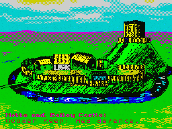
At the start of the game you enter your own name, and immediately become a Sir, your general's name, the Head of Guild's name and the Farm Manager's name. If you're anything like me it'll be family and friends names. It's all very Nintendo. You're then presented with a picture of Motte and Bailey Castle. You're told what type of castle it is, Wooden Keep at the start, and the level of defence it has, Medium to begin with. Your aim is to take control of the land of your king by building a large and healthy population.
Next a screen appears showing your name, title, the turn number and how many solicitors, sorry people, you have. Underneath this is an area full of very well laid out icons which shows Castle, Hunting Party, Fields, Stores, Raiding Party and Overall Health. You're then asked a bunch of questions about allocation of your people to certain tasks like how many should defend the castle and fields, how many go hunting for food, etc. Any remaining people are idle subjects who are not entirely idle as they'll be increasing your population.
You have a chance to re-enter your personnel allocation for the turn if you feel it's not quite right. Then you choose who will be equipped with swords, bows and horses on each of the tasks they've been given. Finally you're asked what level of food rationing will be chosen for this turn, full, medium or low.

Once this is all done onto the next similarly looking icon-filled screen which shows the results of your decisions. Battle outcomes, resources and weapons taken and produced, and deaths and births of people and horses. You and your cabinet, for the want of a better word, are then awarded experience points and a final screen then pops up showing your total losses, resources used and deaths from starvation.
At this point a member of your cabinet may flee with fear or die from exhaustion, meaning the next person in the job will have less experience, starting from level one. On some occasions events will occur including a pleasant visit from a wizard trader and a not so pleasant visit from a fire breathing dragon. Then you're back to the picture of Motte and Bailey castle and the next turn begins. This goes on until you don’t have enough people to run the castle.
Likes
The user interface is wonderful with all the multicoloured icons representing people, weapons and resources shown clearly and concisely, laid out pretty much perfectly. It reminds me of Mego-LoMania on the Amiga and Shadowfire on the Spectrum. I'm using the term user interface loosely as it's mostly about typing in numbers, but it still looks great. At first it seems quite easy, then later you realise it's not as easy as you thought. It pulls you in and then won't let go.
Dislikes
The total lack of any music whatsoever. Just a few spot effects for when typing in numbers or if a dragon attacks. Then again, if the music went on forever it could have been more annoying than the almost total quiet this game provides. It could be worse. At least there's no Jimmy Smits wandering around the screen at any point in the game and you can always listen to your own music.
Verdict
I really enjoyed playing Motte And Bailey Castle. It's very polished and well thought out and it's refreshing to play a new game in a genre that's largely been ignored in more recent years. Lots of fun to be had if you like this type of game, and maybe even if you don't.


